The HP Filter
Learning objectives
Understand trend–cycle decomposition
Interpret the smoothing parameter
Smoothing time series data is useful in many economic situations. The main idea is to try to separate a “trend” from a “cycle.” The smoothed series should not differ too much from the actual data. This is done through a choice of parameters in the filter.
Setup
Suppose we have observations on the log of some time series for , where consists of a trend term, , and a cyclical component, , so that .
The HP filter finds that solves
or, rewriting
where is the ``smoothness penalty.‘’ Note that as , we just have the series, , itself and is just a regression on a linear trend (second difference is 0). Here is a Python implementation:
import numpy as np
import pandas as pd
import pandas_datareader as pdr
import datetime
from statsmodels.tsa.filters.hp_filter import hpfilter
import matplotlib.pyplot as plt
import matplotlib as mpl
from cycler import cycler
from tabulate import tabulate
from matplotlib.dates import DateFormatter
from pandas.plotting import register_matplotlib_converters
register_matplotlib_converters
import matplotlib.ticker as ticker
###from statsmodels.tsa.x13 import x13_arima_analysis
import sys
### Some libraries for web scraping (BLS revisions)
import requests
from bs4 import BeautifulSoup
import time

start_time = time.time()

pd.set_option('display.max_rows', None)

my_colors = ["#00688b",
             "#cd3333",
             "#6c8b3d",
             "cornflowerblue",
             "#cd6600",
             "#8b2323",
             "#5d478b",
             "red"]
plt.rcParams['axes.prop_cycle'] = cycler(color = my_colors)
plt.rcParams['axes.spines.right'] = False
plt.rcParams['axes.spines.top'] = False
plt.rcParams['axes.xmargin'] = 0
#plt.rcParams['axes.ymargin'] = 0.0
plt.rcParams["figure.figsize"] = (10.5,6.5)
plt.rcParams['font.family'] = 'sans-serif'
plt.rcParams['font.size'] = 14
plt.rcParams['legend.fontsize'] = 'medium'
plt.rcParams['legend.frameon'] = False
plt.rcParams['legend.framealpha'] = None
plt.rcParams["legend.loc"] = 'best'
plt.rcParams['axes.titlesize'] = 'xx-large'
plt.rcParams['axes.titlecolor'] = '#3333B3FF'
plt.rcParams['lines.linewidth'] = 3

plt.rcParams['figure.subplot.left'] = 0
plt.rcParams['figure.subplot.bottom'] = 0
plt.rcParams['figure.subplot.right'] = 1
plt.rcParams['figure.subplot.top'] = 1

def crosscorr(datax, datay, lag=0):
   return datax.corr(datay.shift(lag))

def NBER(start_date):
    ax2 = ax.twinx()
    Recessions = monthly['recessiondates'][monthly.index >= start_date]
    ax2.fill_between(Recessions.index,
                     Recessions,
                     step="pre",
                     color="gray",
                     alpha=0.2)
    ax2.get_yaxis().set_visible(False)
    return ax2

def simpleaxis(ax):
    ax.spines['top'].set_visible(False)
    ax.spines['right'].set_visible(False)
    ax.get_xaxis().tick_bottom()
    ax.get_yaxis().tick_left()

def day_format(label):
    """
    Convert time label to the format of pandas line plot
    """
    return f'{label.month} {label.day}'

def month_format(label):
    """
    Convert time label to the format of pandas line plot
    """
    month = label.month_name()[:3]
    if month == 'Jan':
        month = month + '\n' + f'{label.year}'
    #else:
    #    month = ""
    return month

def quarter_format(label):
    """
    Convert time label to the format of pandas line plot
    """
    month = label.month_name()[:3]
    if month == 'Jan':
        month = f'Q1\n{label.year}'
    if month == 'Apr':
        month = 'Q2'
    if month == 'Jul':
        month = 'Q3'
    if month == 'Oct':
        month = 'Q4'
    return month
Now we will read in some data.
### Quarterly

FREDmap = {
    'GDPC1': 'real_gdp'
    }

quarterly = pdr.DataReader(list(FREDmap.keys()), 'fred', datetime.datetime(1800,1,1))
quarterly.rename(columns = FREDmap, inplace = True)

quarterly.to_pickle('quarterly.pickle')
quarterly['real_gdp'].tail()DATE
2023-07-01 22780.933
2023-10-01 22960.600
2024-01-01 23053.545
2024-04-01 23223.906
2024-07-01 23386.733
Name: real_gdp, dtype: float64def EconLineGraph(dataframe = None,
series = None,
labels = None,
title = None,
subtitle = None,
source = None,
ylabel = None,
start_date = None,
end_date = None,
graph_name = None,
recessions = False,
logscale = False,
ylines = None,
yzero = False):
"""For creating line graphs from a data frame
Inputs:
-------
dataframe : dataframe
The dataframe containing the data to be plotted
series : vector of text
The "names" of the variables to be plotted
labels : vector of text
The labels (descriptions) of each variable
title : text string
Title for the figure
subtitle : text string
A "title" which appears at top left of the figure
source : text string
The source for the data; appears at bottom right of the figure
ylabel : text string
Text that appears beside the y axis
start_date : string
The first date to appear in the figure (end date is always the last available
observation). String as 'yyyy-mm-dd'.
graph_name : text string
The basename for the graph files. Both pdf and png files are produced
recessions : logical
If True, then include NBER business cycle recession shading from
the dataframe "monthly"
"""
if start_date == None:
df = dataframe[series].dropna(how = 'all')
start_date = df.first_valid_index()
else:
df = dataframe.loc[start_date:][series].dropna(how = 'all')
fig, ax = plt.subplots()
if logscale:
ax.set_yscale('log')
ax.yaxis.set_major_formatter(plt.FormatStrFormatter("%.0f"))
ax.yaxis.set_minor_formatter(plt.FormatStrFormatter("%.0f"))
if recessions:
ax.plot(df, clip_on = False)
else:
df.plot(ax = ax, clip_on = False)
if yzero is True:
plt.axhline(y = 0, color = '#a0a0a0', linewidth = 0.75, label = None)
else:
if ylines is not None:
if len(ylines) == 1:
df[str(ylines)] = ylines[0]
df[str(ylines)].loc[start_date:].plot(ax = ax, clip_on = False, color = '#a0a0a0', linewidth = 1.0)
else:
for i in ylines:
df[str(i)] = i
df[str(i)].loc[start_date:].plot(ax = ax, clip_on = False, color = '#a0a0a0', linewidth = 1.0)
if title is not None:
ax.set_title(title)
if subtitle is not None:
ax.set_title(subtitle,
loc = 'left',
color = 'black',
size = 'medium')
if ylabel is not None:
ax.set_ylabel(ylabel)
if labels is not None:
#if ax.get_legend() != None:
ax.legend(labels)
#ax.legend().set_zorder(2)
else:
if ax.get_legend() != None:
ax.legend().set_visible(False)
if source is not None:
ax.set_xlabel('Source: ' + source,
horizontalalignment='right',
x=1.0)
else:
ax.set_xlabel('')
if recessions:
ax2 = ax.twinx()
Recessions = monthly['recessiondates'][monthly.index >= start_date]
ax2.fill_between(Recessions.index,
Recessions,
step="pre",
color="gray",
alpha=.2)
ax2.get_yaxis().set_visible(False)
ax2.set_ymargin(0)
fig.savefig('pyfigs/pdf/' + graph_name + '.pdf', bbox_inches='tight', pad_inches=0.25)
fig.savefig('pyfigs/png/' + graph_name + '.png', bbox_inches='tight', pad_inches=0.25)
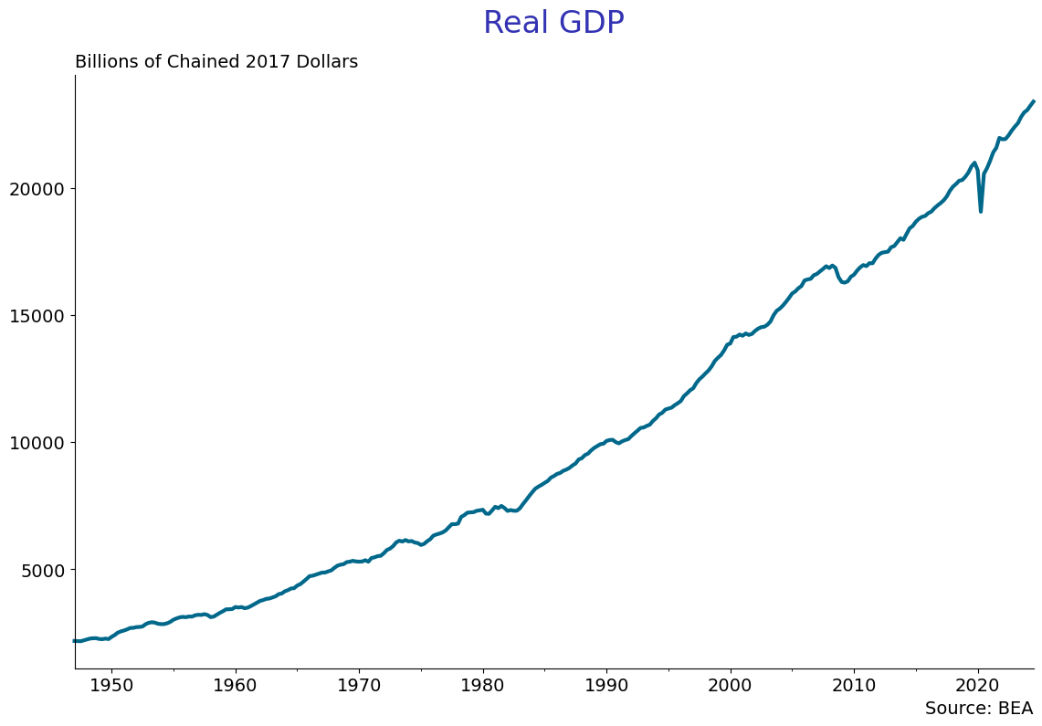
EconLineGraph(dataframe = quarterly,
              series = ['real_gdp'],
              title = 'Real GDP\n',
              subtitle = 'Billions of Chained 2017 Dollars',
              source = 'BEA',
              start_date = '1947-01-01',
              graph_name = 'log_real_gdp',
              logscale= False)
Take the log of real gdp and create the hpfilter, using 1600 for .
quarterly['lrgdp'] = np.log(quarterly['real_gdp'])
hpcycle_gdp, hptrend_gdp = hpfilter(quarterly['lrgdp'].dropna(), lamb=1600)
quarterly['hptrend_gdp'] = hptrend_gdp
quarterly['hpcycle_gdp'] = hpcycle_gdp
Now graph the real gdp series and the hp trend.
EconLineGraph(dataframe = quarterly,
          series = ['lrgdp', 'hptrend_gdp'],
          labels = ['GDP', 'HP Trend'],
          title = 'Real GDP and HP Trend\n',
          subtitle = 'Log of Trillions of 2017 Dollars',
          source = 'BEA',
          start_date = '1947-01-01',
          graph_name = 'hp_log_real_gdp',
          logscale= False)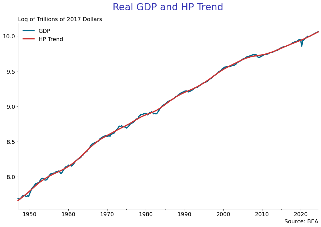
EconLineGraph(dataframe = quarterly,
          series = ['hpcycle_gdp'],
          title = 'Real GDP Cyclical Component\n',
          subtitle = 'Log of Trillions of 2017 Dollars',
          source = 'BEA',
          start_date = '1947-01-01',
          graph_name = 'hp_cycle_log_real_gdp',
          yzero = True,
          logscale= False)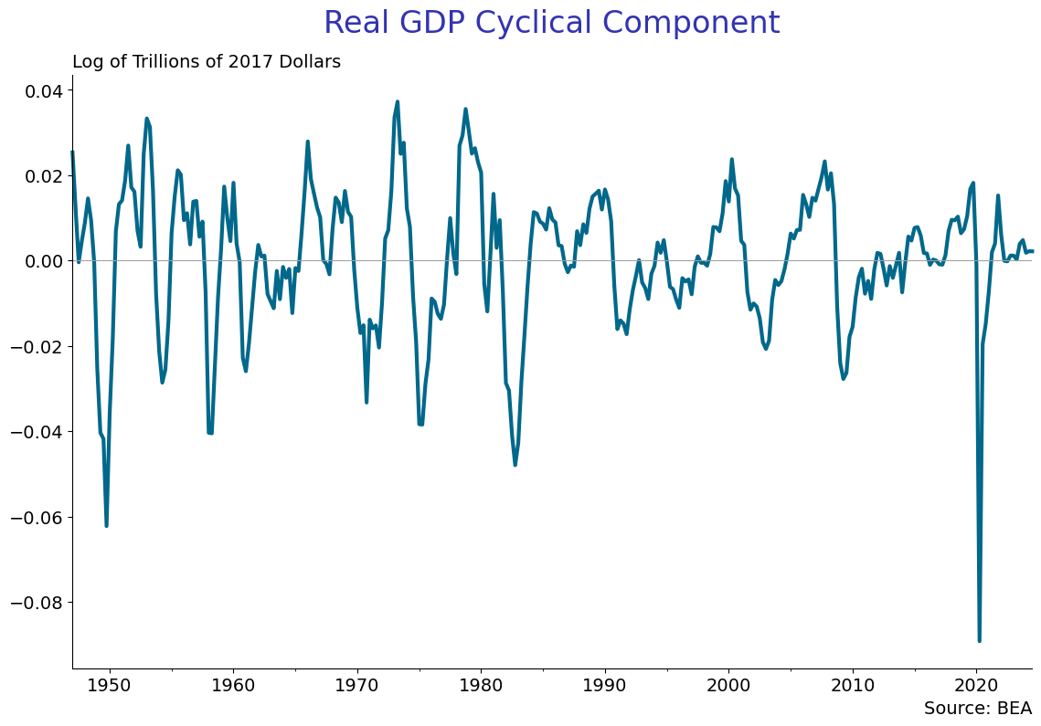
Homework #1:
(A) Use a very large number for , like 16000000000 and see the trend and cycle. Explain what is going on. Next plot the cylical component for the two different ’s and comment on the difference.
(B) Download GDPCA from FRED. This is annual real GDP back to 1929. Should you use ? Why or why not? If not, what value should you use? Why?